
Vanity Co.
A hair salon a cut above the rest
When your business is based on style, it had better be reflected in your brand. Rick Camacho is a talented hair stylist who makes his clients look good everyday. But his name and logo didn’t fit his vision of a modern hair salon. He approached me for help which was easy because I had been a client for years.
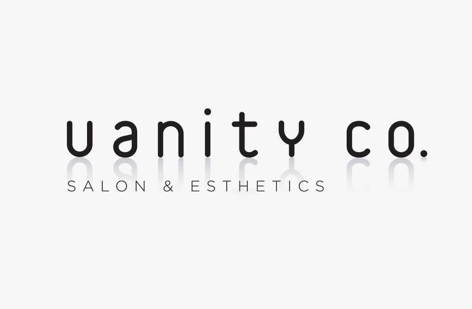
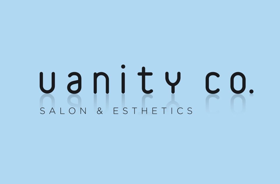
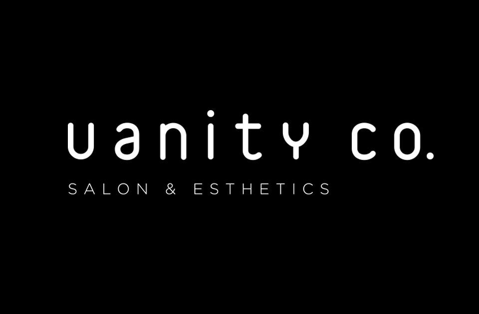
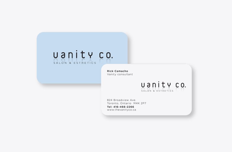
Part of the problem was the original name The Vanity COOP. I recommend shortening it to Vanity Co. which had a witty and more urban tone. The next step was crafting a wordmark that was sophisticated but gender neutral so that it would appeal to both his male and female clients. The final conceptual touch was to add a reflection beneath the letterforms to reinforce the new name.
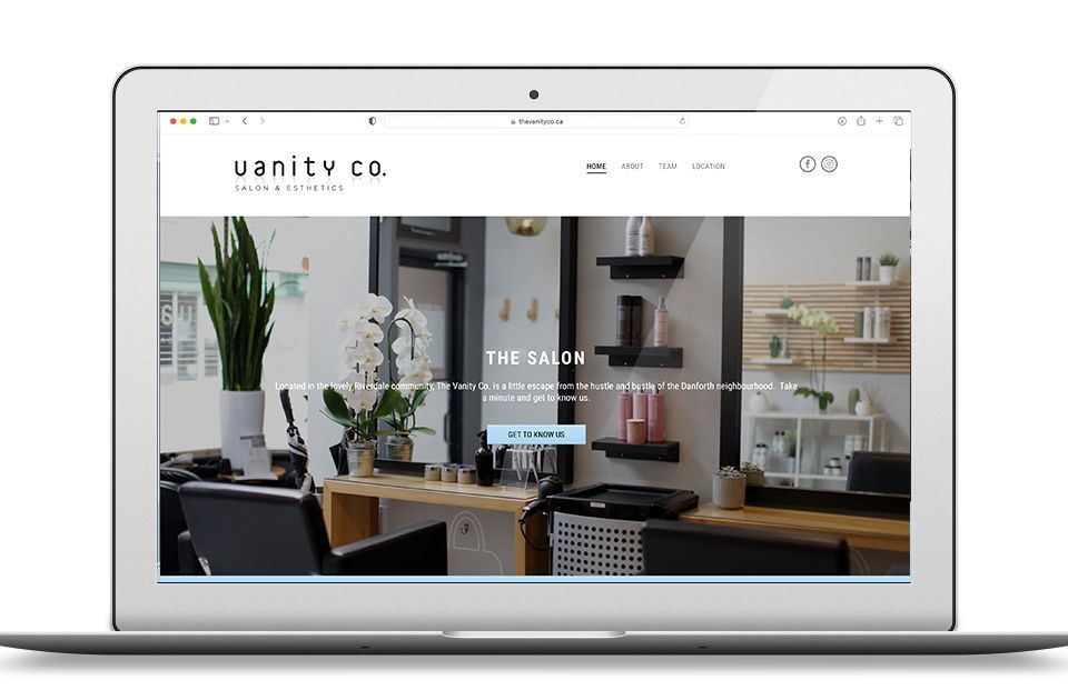
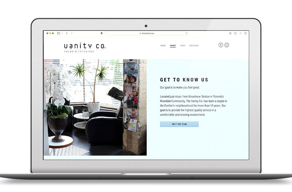
With the recent launch of the company website, the Vanity Co. now has the look that Rick aways wanted. An image that reflects a modern, stylish neighborhood salon.
Scope of work
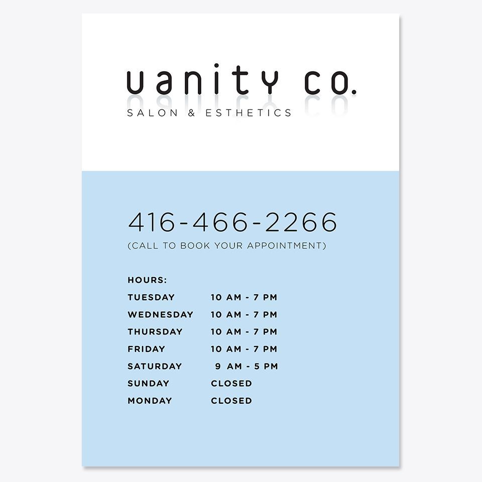
- Brand identity
- Website
- Business cards
- Signage
- Appointment cards