Hip to be Square
How the noble square plays an essential role in graphic design, from famous symbols to its use in modern social media
By David Thorne in Applied Arts Magazine, August 11, 2016
The term “graphic” in graphic design must come from how fundamental geometric shapes are in our profession. Whether it is a triangular shape for a symbol, the circular form of a pie chart or the rectangular column structure of a book or webpage, these basic elements are the foundation. But while circles and triangles have their own unique appeal, the square has proven historically to be most practical form.
The psychology behind a square and what it can communicate is useful when designing a logo. It is solid, secure and stable. With equal sides and 90-degree angles, it represents mathematics, rationality and formality. It is a very familiar, trusted shape. Naturally, it is very popular with banks, accountants and insurance companies.
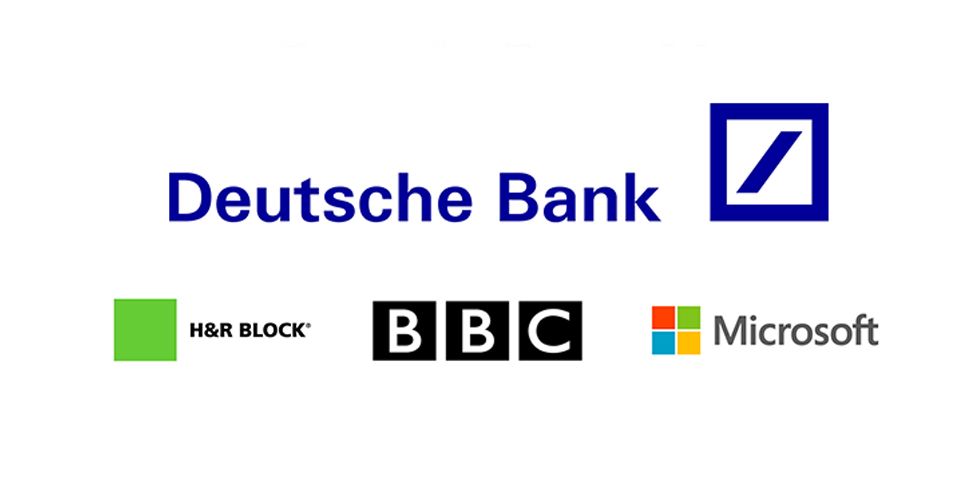
The Deutsche Bank logo designed by Anton Stankowski in the 1970s is a good example. The symbol conveys security and stability. Patrick Burgoyne, the editor of Creative Review, describes it well. “The Deutsche Bank square is a neat visual shorthand for the type of values you might want in a bank-security (the square) and growth (the oblique line).” Other examples are H&R Block, the BBC and Microsoft.
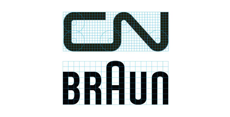
While the square is useful as a containing shape, it is especially useful as a module in the underlying construction of a symbol. Two famous historical identities illustrate this’the CN logo drawn by Allan Fleming in 1959 and the Braun wordmark created by Wolfgang Schmittel. The module gives the continuous line of CN a uniform thickness, while in the case of Braun it also defines the letter spacing between the characters. Both identities are still in use today, proving their lasting value.
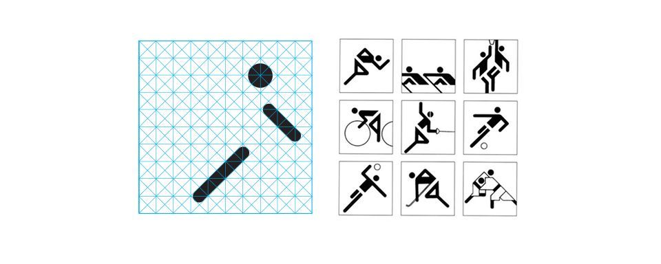
Simple letterforms made out of squares are easy to create but what about a form representing taekwondo or synchronized swimming? The 21 Olympic pictograms designed by Otl Aicher for the 1972 Munich Olympic Games were drawn on a grid of square and diagonal lines. What makes the pictograms so successful are their simplicity and elegance. Despite using such a severe structure, the forms are fluid and illustrate each sport beautifully.
This approach might seem too rigid by today’s aesthetic standards but it demonstrates the valuable design principle of unity. When design elements repeat, like shape, it makes the composition harmonious and unified to the viewer. This design principle is as relevant today as it was in the ’60s.
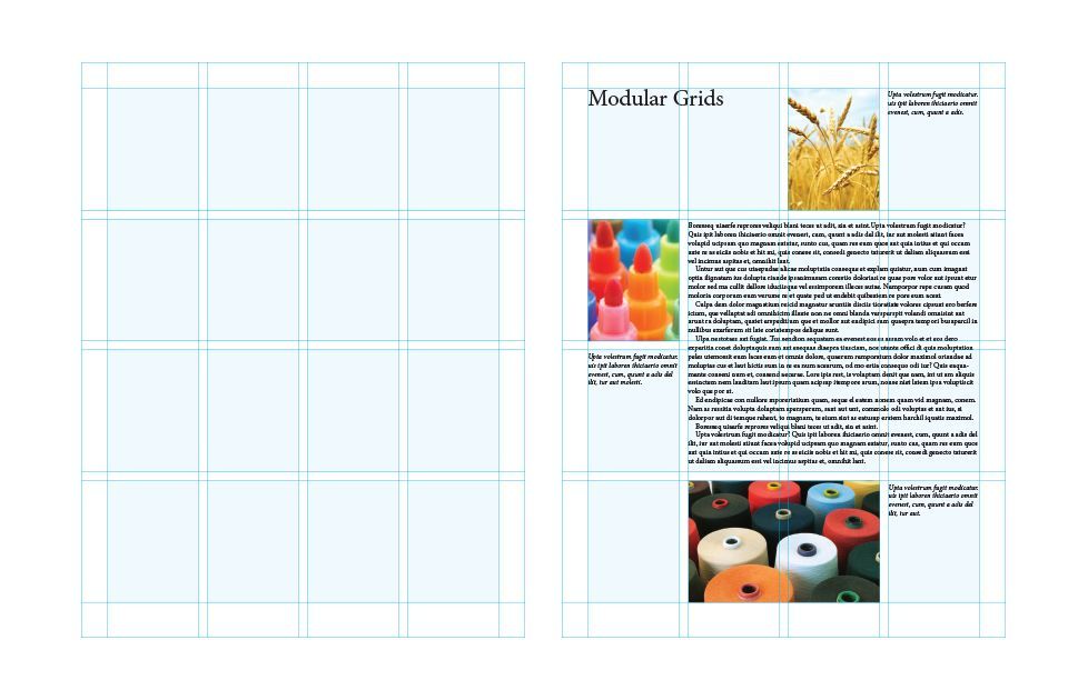
This theory can be extended from a single graphic to the complexity of a page with text, image and graphic elements. A designer can employ a “modular grid” to the page so that the elements are composed coherently and the information is well organized.
A modular grid is made up of a series of horizontal and vertical guidelines separated by gutters that divide up the space into square or rectangular units. These units govern how images are cropped and the placement of the text on the page. This structure is an invisible design tool devised by the Swiss designers in the 1960s, such as Emil Ruder and Josef Müller-Brockmann. But legendary contemporary designers like Massimo Vignelli considered them essential when designing books. He is famous for saying, “A grid is like underwear, you wear it but it's not to be exposed.”
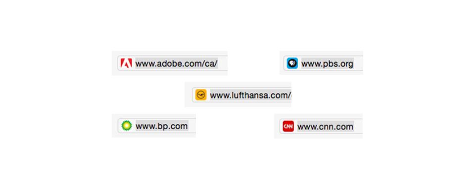
The use of squares is not limited to print. When coding a website, the CSS box model defines elements as squares and rectangles. In fact, the whole Internet is built with squares or pixels. For example, the tiny icon beside the URL in a browser’s address bar is a favicon. It is a square shape made up of 16 pixels by 16 pixels and is the most challenging scenario to legibly display a company’s brand. But many succeed using this tiny square shape.
Nowhere are squares more widespread than mobile devices and social media platforms such as Facebook, Instagram and Twitter. The grid of apps on smartphones and tablets are a very efficient visual menu but the shape is limiting. Names with too many characters aren’t legible in the tiny squares, so brands are reduced to little monograms such as the Facebook F or Pinterest P. While this widely used approach is now understood, an icon or symbol can have more conceptual meaning such as the compass for Apple’s Safari browser or blue chirping bird for Twitter.
Regardless if your design approach is based on the Swiss style of the 1960s or an expressive, contemporary aesthetic, the square is a workhorse and the most useful and practical shape in design. It’s as important today as it was in the early days of our profession.