Putting A Human Face On Brands
Want to make a deeper connection with consumers? Try using human features in your logo.
By David Thorne in Applied Arts Magazine, January 14, 2015
How can designers create memorable logos that make a real connection between the brand and their customer? What ideas resonate with an audience and have the strength to go beyond trends to truly last?
These are designers’ unstated goals when they begin to draw a new symbol, but too often the results are cold, impersonal and abstract. The marks that avoid that outcome have something in common: Qualities that are distinctly human. An open eye, a smiling face, a reaching hand or a figure in motion have strong, lasting appeal because they’re like mirrors where we recognize the reflection. This simple strategy can be very powerful.
William Golden understood this when he was in charge of creating a bold identity program for CBS. Inspired by Pennsylvania Dutch and Shaker symbols of the “all-seeing” eye, the simple graphic of an open eye quickly became known for the American television network. Golden thought the eye symbolized CBS “looking at the world,” and the concept was applied across all media from broadcast and collateral to signage and advertising campaigns. Its longevity proves that using human features works. The mark has been unchanged since it was first drawn in 1951.
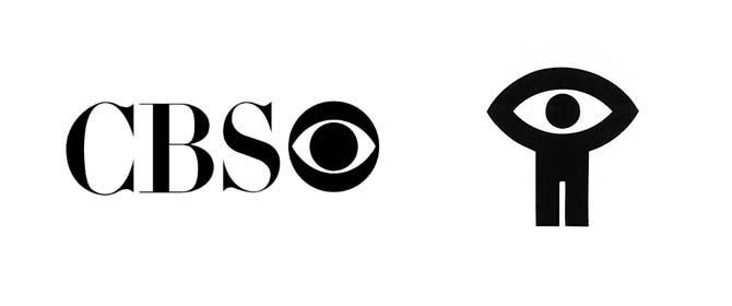
In Canada, Georges Beaupré used more than just an eye in 1969 to identify our National Film Board. He drew a figure with its arms reaching up, and a matching arch to create an open eye. Like many identities, it could have many levels of meaning, but the NFB simply nicknamed it “Man Seeing / L’homme qui voit.”
But why would images of human features be more appealing than abstract images? Scientific research gives us the answer. A famous study of perception by Robert Fantz, an American developmental psychologist, concluded that babies looked twice as long at graphics of simplified faces than other abstract shapes in a circle. And Dr. Siu Lan Tan, in a recent article in Psychology Today, argues that we are drawn to faces because it might be a matter of survival. “We must register quickly if there is a stranger in our midst, and sense if this is a friendly or threatening presence. In short, we may be hard-wired to focus on faces as they provide information that is fundamentally important to our physical and social survival.”
The human face has been compelling subject matter for many older and contemporary brands. Goodwill Industries, designed by Joseph Selame, and the PBS mark, first drawn by Herb Lubalin and then refined by Chermayeff & Geismar, are two examples that are still in use. I have always liked the smiling “G” for Goodwill, peeking from a window, and the repeating profiles for PBS simply illustrates its audience – the American people.
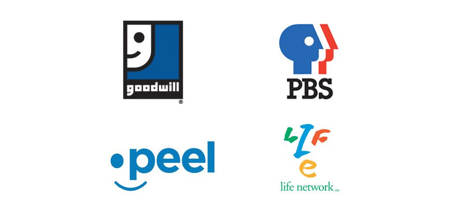
The Peel District School Board logo, designed by Hambly and Woolley, and Life Network, created by my firm, are both recent Canadian examples. They use a face to convey a children’s public school district and a specialty channel dedicated to leisure activities.
The entire human figure can be an equally evocative subject matter. From prehistoric cave drawings that recount “the hunt” before written language to the pictograms of the Olympic Games that universally communicate each event without translation, drawings of the human form have been used to tell complex and emotional stories.
As children, we quickly learn how to draw a person with our first crayon, but with some talent and skill a graphic designer can take a stick figure and communicate modern telecommunications, international travel or health care services.
Wolff Olins’ mark for British Telecom first impressed me in 1991. I admired the trumpeting figure drawn to resemble the red and blue stripes of the Union Jack. In another example, American firm Hornall Anderson Design Works gave the online brokerage firm Redfin an aspiring homeowner reaching to find their ideal house.
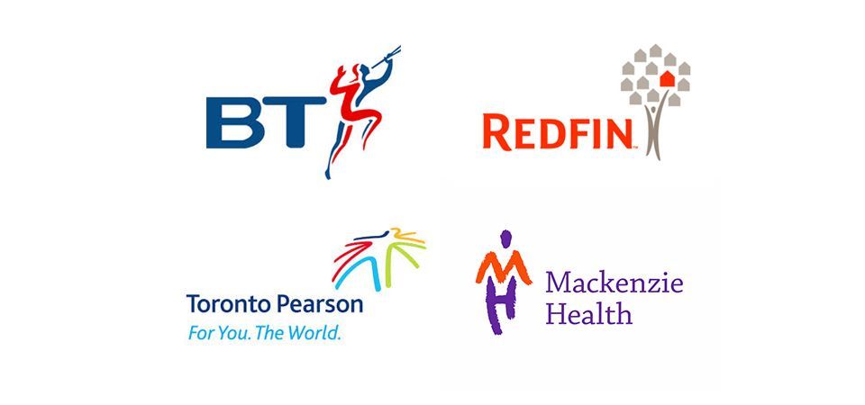
In Canada, the Greater Toronto Airport Authority was rebranded by Ove Design using a body drawn from global airline routes. My firm created the identity for Mackenzie Health, a hospital network, using a human figure confidently striding towards the future.
To prove the lasting appeal of brands that use human characteristics, Counter-Print published Human Logo: Trademarks & Symbols last year. The title explores the theme of people-based logos with over 300 identities. Its release celebrates the use of human features in branding and supports the idea that brands can really connect with their customers when they are filled with warmth and emotional human character.
Originally published in Applied Arts Magazine, January 14, 2015