Viva Portugal: A Study In Typography
Successful examples of Portugal's bold typographic branding
By David Thorne in Applied Arts Magazine, October 14, 2014
Can a country be known for a particular design style? Are the Germans more disciplined, the English restrained and the Japanese minimalist? Or can any country have a distinctive voice when we have access to everyone’s work instantly? Our local peers no longer influence our work. Instead, there is a vast international community of designers. But on a recent trip to Portugal, I noticed something bold and refreshing coming from their designers – something distinctly typographic.
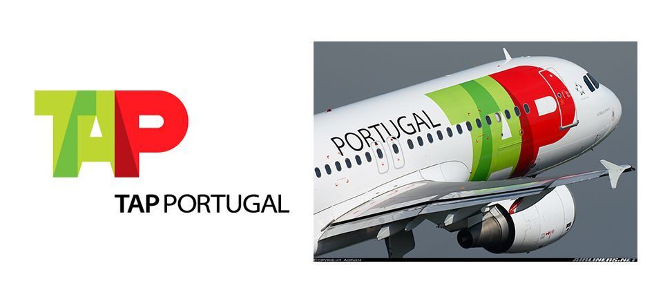
It happened immediately when I landed in Lisbon’s airport. The livery for TAP Portugal, the national carrier, caught my eye. Using only typography to brand an airline is risky. The traditional approach of a symbol and type signature, such as Air Canada’s or Lufthansa’s, is more common. But Goncalo Cabral, the Portuguese designer responsible for the 2005 rebranding, wanted to do something different. His modern monogram is strong, geometric and quite unconventional. The extreme negative kerning of the three capital letterforms ignores rules about legibility in favour of a trendy transparency effect using the two colours from the Portuguese flag.
Another unique monogram is the identity for the Museu Arqueológico do Carmo (MAC), which I discovered while exploring the Barrio Alto neighborhood. The museum is located in what remains of a Carmelite church nearly destroyed by the devastating earthquake of 1755. Distinctive features of the ruins are the graceful arches of its roof. With a clever bit of modification, the letterforms suggest this feature while the remaining negative space nicely holds the name of the museum. The identity has an appealing and spare modernity.
I found two arts and cultural festivals branded typographically.
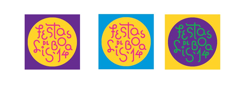
Festas de Lisboa is a month-long summer event of concerts, fairs and theatre in the capital’s historic neighborhoods. The festival is branded using hand-drawn type positioned without a baseline in a circle shape. The letterforms are composed of simple straight and circular strokes. The effect is fun, whimsical and surprisingly legible.
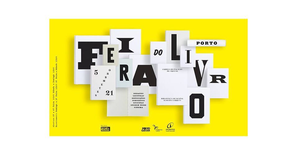
The creative for Feira do Livro, a book fair and literary festival in the northern city of Porto, is more sophisticated. Its name is spelled out using multiple font styles, each printed on the pages of a book to provide dimension and visual depth. The contrast of styles is particularly well done and suggests a range of literary topics.
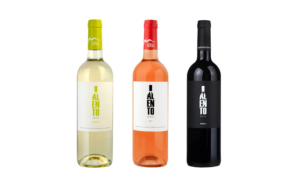
While dinning at a tasca, or tavern, I admired the stark and typographically bold label of the wine bottle I had ordered. Portuguese wines don’t have the international reputation that the French or Italian enjoy so perhaps to stand out on the shelves, their designers need to do something unique. Avoiding the cliché of illustrations of vineyards and boring scripts, the Alento winery uses a simple type-only solution.
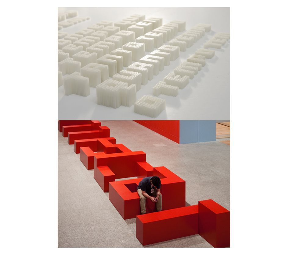
These examples all made me curious. After some research into Portuguese graphic design, I discovered the multidisciplinary design studio R2. The studio portfolio of identities, signage systems, environmental and art installation projects are heavily influenced by type. But the work of Lizá Defossez Ramalho and Artur Rebelo goes beyond the printed two-dimensional form exploring how type can be animated, have physical weight, texture and even be the furniture in a room. These designers love typography and proudly explore its creative potential for their Portuguese clients.
So are the Portuguese especially typographic? Do they express themselves more with type than other forms visual expression?
Certainly, what I saw was only a fraction and I am biased. I love type and can’t help notice interesting work when I travel. But the graphic design that I saw was bold and took risks, very often with type. It avoided the obvious and strove for innovative typographic answers.
This is a virtue worthy of praise and something Canadian designers can admire.
Originally published in Applied Arts Magazine, October 14, 2014