The New Standard
Improve your standards manual with these five tips
By David Thorne in Applied Arts Magazine, November 11, 2015
I love collecting and examining identity standards manuals. It gives me insight into how designers think and their design process, which helps me create better manuals for my own clients. I am not the only one. A reissue of the 1975 NASA Graphics Standards Manual was a huge success in a US$941,967 Kickstarter campaign.
Manuals all have a simple goal: to ensure that a company’s brand is used correctly and applied consistently across a range of media. There is a real art to designing and writing them. It requires a lot of discipline where the instructions are simple, clear and unambiguous.
By studying other manuals and designing many myself, I have learned important things about what makes them successful. Here are my five tips.
1. Start with Pantone but test and adjust for the best colour
All manuals need to specify colour so that an identity can be reproduced consistently. For years, I would trust Pantone’s fan decks, which provide solid colours and their equivalent formulas for CMYK, RGB and HTML as a definitive reference. However, over the years I changed my approach and found that, in online forums, other designers have as well.
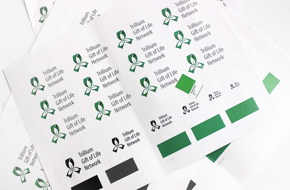
When selecting colour for a logo, consider how the customer will experience it the most and then consider how that colour is reproduced. Is it a storefront sign (3M vinyls), an e-commerce website (RGB) or digitally printed stationery (CMYK)? Some reproduction methods will limit the choices for colour. For example, if you are doing a sign, there is only a small range of coloured vinyls. If you are printing CMYK, consider that some oranges and greens don’t reproduce well in process colours.
Then start with a solid Pantone and see how it will reproduce. I often do a lot of testing and adjusting until I arrive at a CMYK formula that works. For a recent identity, various CMYK formulas of a green were tested with digital and press proofs. The formula was not the same as Pantone but that’s what went into the manual.
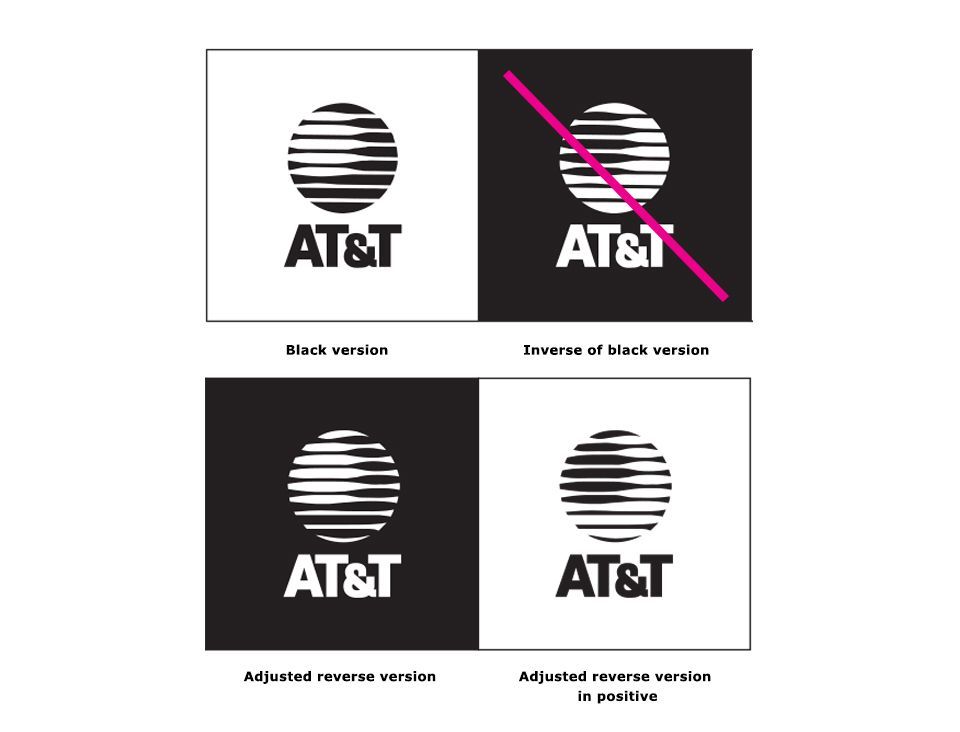
2. Reverse version is not just the inverse of black
A reverse version is typically an inverse of the black version of a logo — however, modifications might need to be made so the reverse version has the same appearance as the black version.
Saul Bass, the famous American designer, understood this problem when he drew the AT&T logo in 1984. To preserve the highlight on the famous “Death Star”, he carefully adjusted the linear shapes so the black and reverse matched. Gary Ludwig, a fellow professor at OCAD University, provided me with this great example.
3. Determine the right clear space
All manuals include clear space rules. The clear space is a defined area surrounding a logo that protects its integrity when placed in proximity to other competing visual elements. For example, determining a logo’s clear space is necessary when it’s part of a line of sponsors at the bottom of a poster or how far it should be positioned from the top left corner on a website. Typically this measurement is based on a part of the logo itself. This will guarantee that regardless of scale, the measurement will always be the same. As the logo increases or decreases in size so will the clear space measurement.
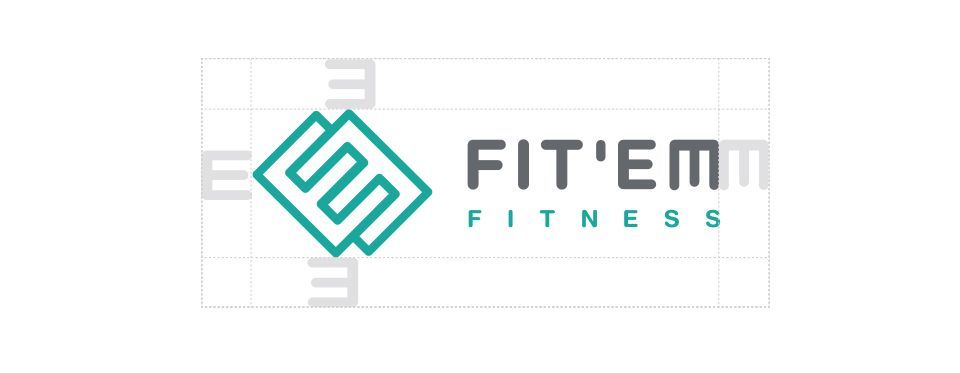
The distance should be defined by clear edges like a character’s cap height or a shape with parallel edges. If the measurement is a shape taken from the logo, like the “M” in the example, then ideally it should be a square because it would make the distance consistent around the logo regardless of the shape’s orientation.

4. Minimum size in mm and px
Providing a minimum size prevents a user from making the logo illegibly small. Again a list of sponsors for an event is a good example of when this is important. Minimum size should be specified for print and digital. Use millimeters for print because it’s more precise than imperial, and pixels for digital. A horizontal measurement is more accurate. I like to use a small banner ad to determine the minimum size online. A range of sizes of the logo and its clear space will show which one is the best minimum size.
5. Don’ts that users are likely to do
Examples of logo misuse is another popular page in a standards manual. The page is often called “Don’ts” because it is involves language such as “Don’t warp or distort the logo” or “Don’t render the logo in 3D.” While it never ceases to amaze me how much a logo can be misused, I recommend including examples that are much more likely to happen. For example, using the logo in text, such as a headline, or placing the logo over a complicated part of a photo, which makes it hard to see.
For a great resource of 83 famous manuals, check out Logo Design Love by David Airey.
Originally published in Applied Arts Magazine, November 11, 2015