Trillium Gift of Life Network
Redrawing an iconic flower
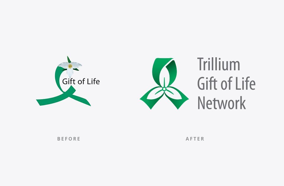
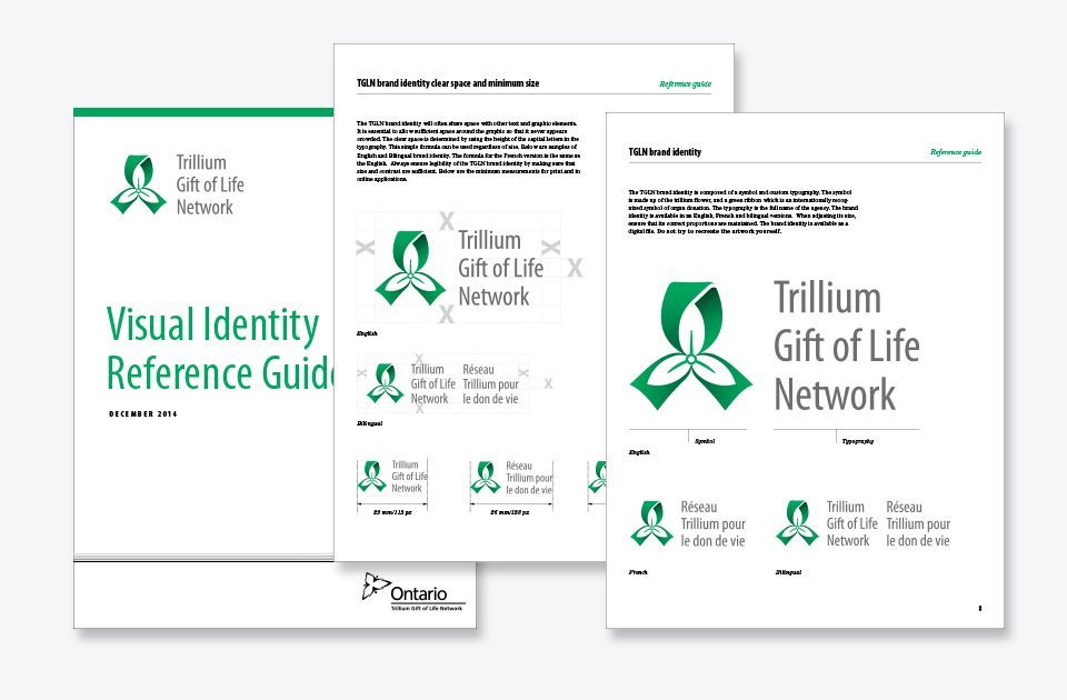
Trillium Gift of Life Network’s (TGLN) mission is saving and enhancing lives through the gift of organ donation in Ontario. The symbol that identified TGLN had a strong concept combining a provincial trillium flower and a green awareness ribbon (an international symbol of support for organ and tissue donation). However, its execution was weak and impractical using a graphic ribbon with a photographic flower. The logo didn’t scale well and the agency name was surprisingly missing.
“We were thrilled with David throughout the entire project. He had a lot of experience, understood our needs and considered our feedback very thoughtfully. The result was a huge improvement to our brand and identity, and the process to get there was very smooth. We could not have been happier with the final result and it has been embraced by staff and stakeholders.”
Mary Ellen Armstrong, Former Director of Communications, Marketing and Public Affairs, TGLN.
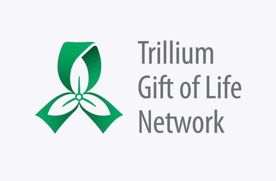
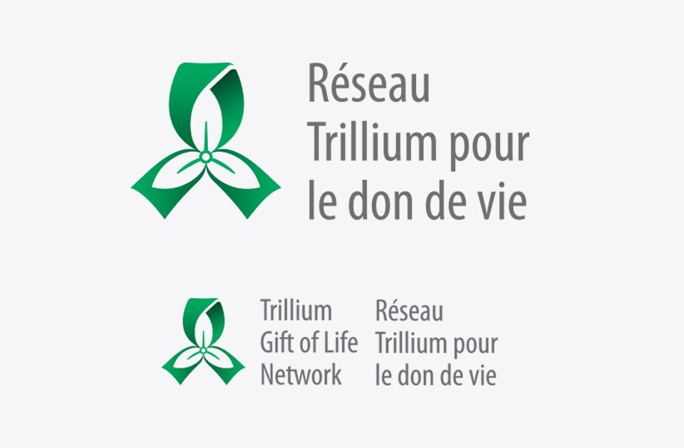
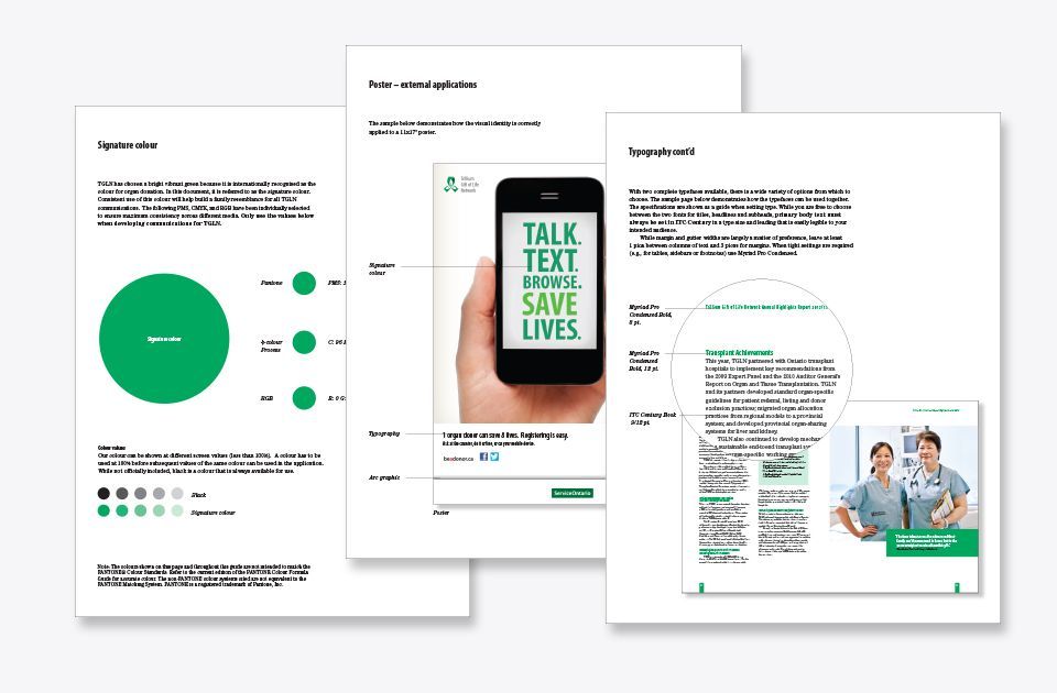
The goal of the rebranding was to preserve the ribbon and trillium visual concepts and combine them into an appealing graphic using their signature green colour. Their name was integrated with the new symbol using a typographic system for both official languages. Adding a subtle gradation to the green ribbon gave the shape more movement and dimension. The result was a more attractive mark that scaled well and had a clear and legible company name. A comprehensive standards and guidelines manual was written to ensure the correct usage of the new logo for the agency’s corporate and marketing communications.
Scope of work
- Brand identity
- Branded MS templates
- Standards and guidelines manual