


Mackenzie Health
A regional healthcare network
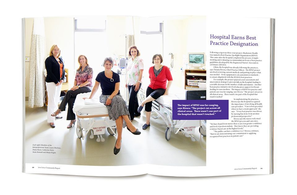
Sometimes, all it takes is the right design solution to help create a fresh vision for community healthcare. That’s certainly the case with my new client Mackenzie Health, where the brief was to design a brand identity to launch southern Ontario’s newest major regional healthcare network. Everything about this project was major in scope: Mackenzie Health includes two full service hospitals and a network of local community-based services across southwest York Region.
I teamed with project leaders, Fleishman Hillard and research specialists, MacPhie & Company to build and implement a unified brand architecture capable of connecting the many parts of the organization. The first step in the branding process was to generate a new name for the enterprise. We arrived at the solution “Mackenzie” Health, named for a local historical figure and the road linking the two hospitals.
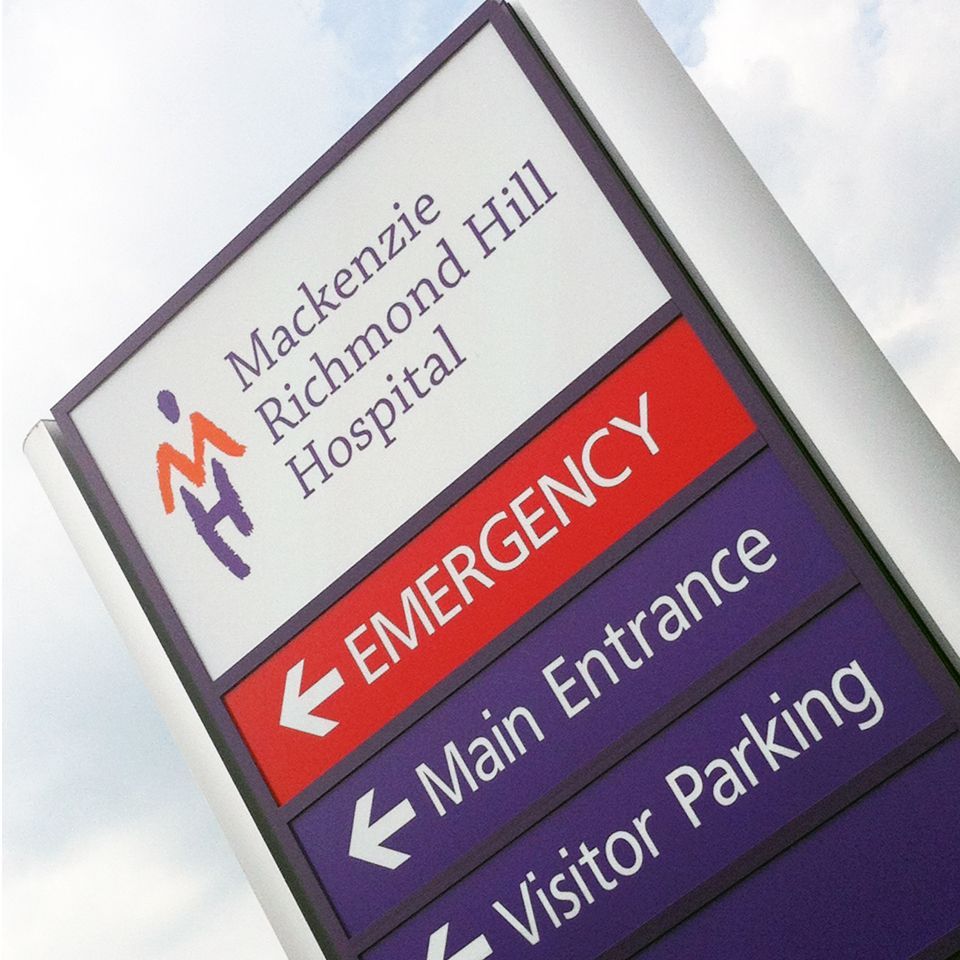
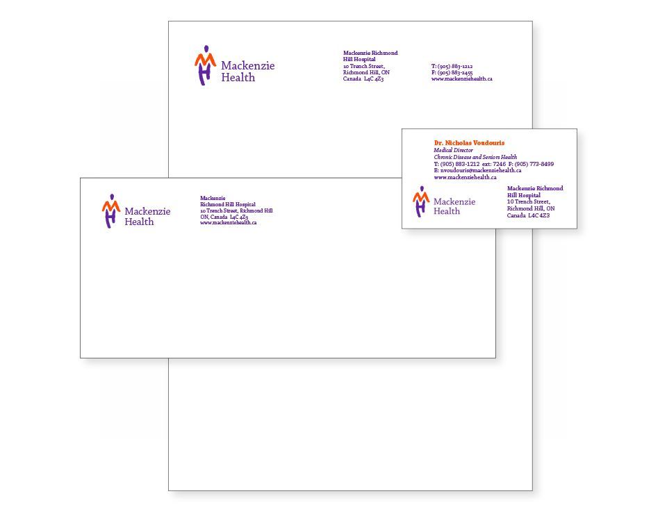
From my design perspective, the challenge was to distill the entire organizaiton into a single, compelling visual mark. Their symbol is hand-drawn to look like a human figure confidently striding towards the future. Its body is composed of the initials (M & H) of the brand name. My new brand identity is now being used everywhere from stationery to signage, brochures, posters and hospital ID-badges. Thus far, the feedback is positive in the extreme – especially from our main client who in a key meeting, reported “being wowed” by the work.
Scope of work
- Brand identity
- Corporate stationery
- Pocket folder
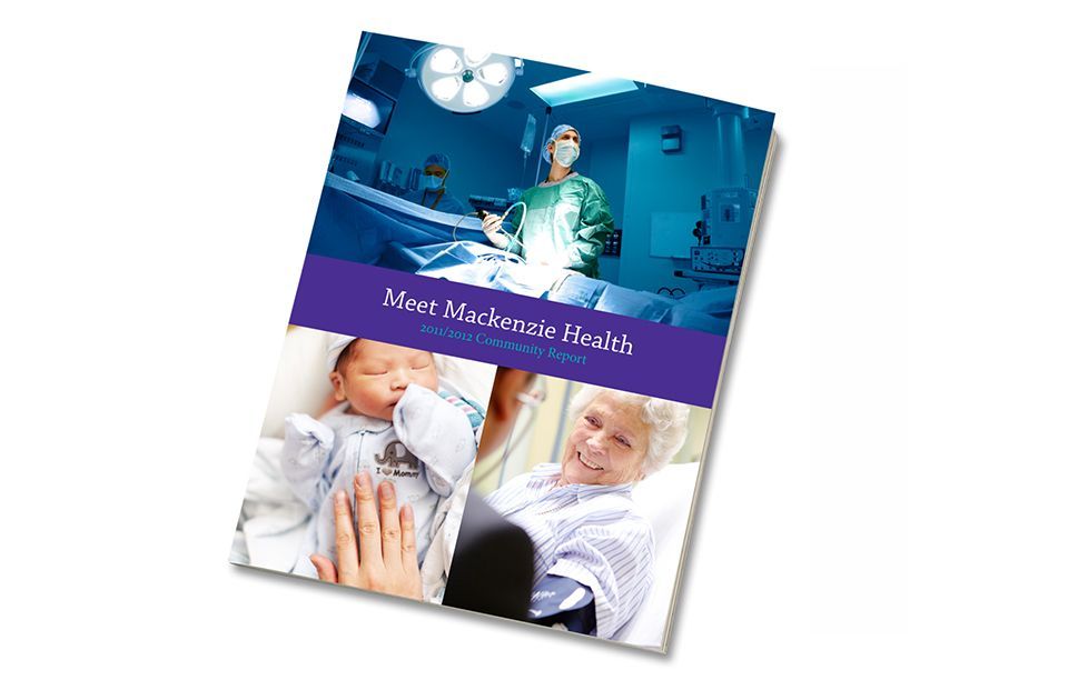
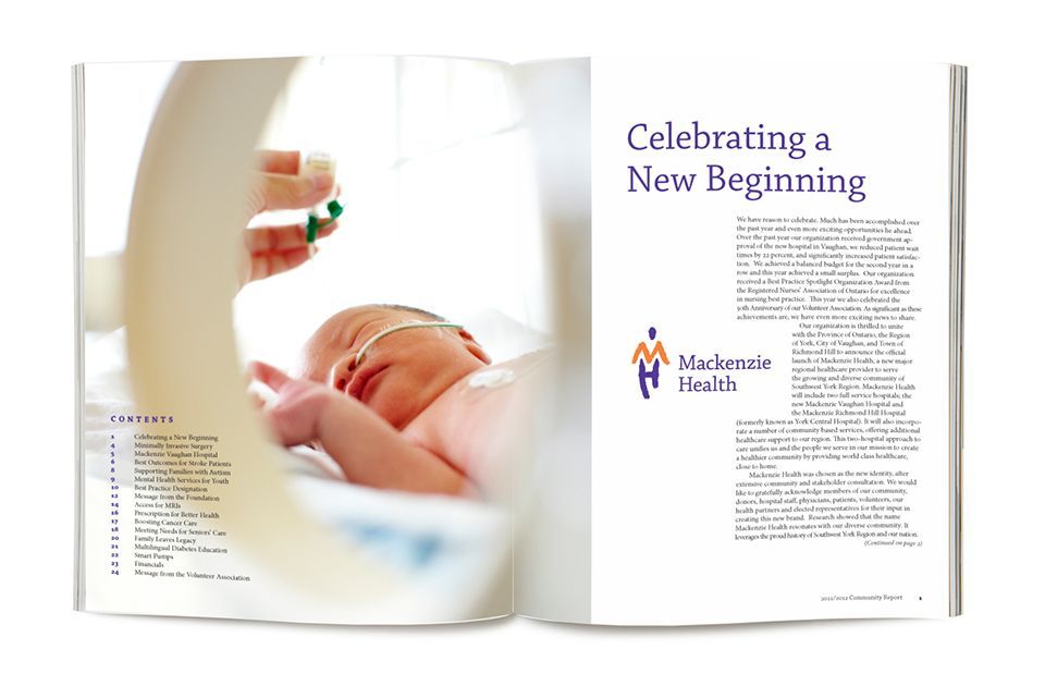
- Annual report
- Brochure
- Exterior signage
- Exhibit design
- Promotional posters
- Corporate video