


OE Utility Services
More than just a hydro excavation company
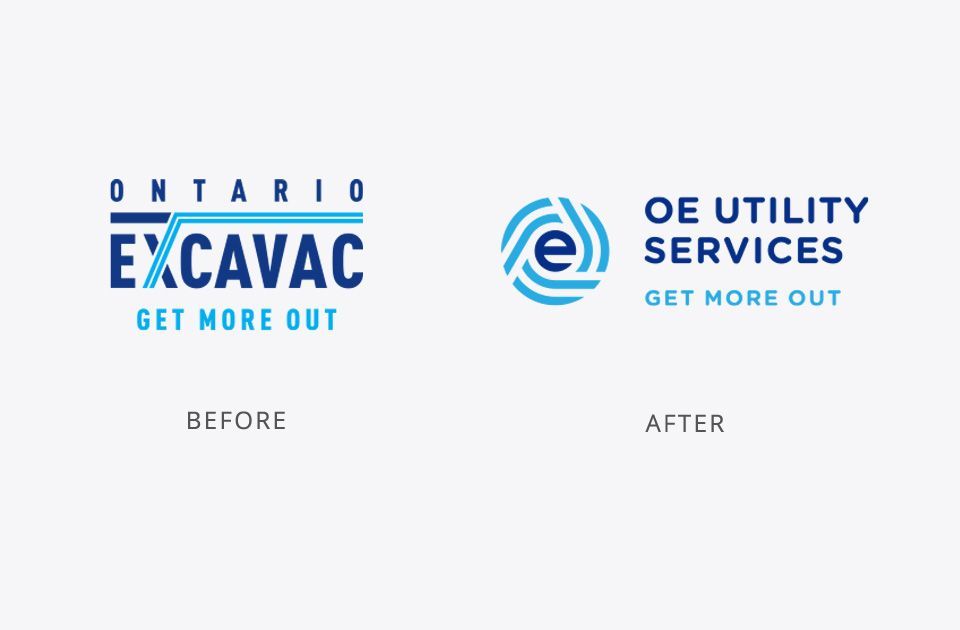
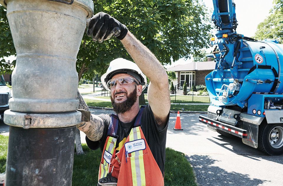
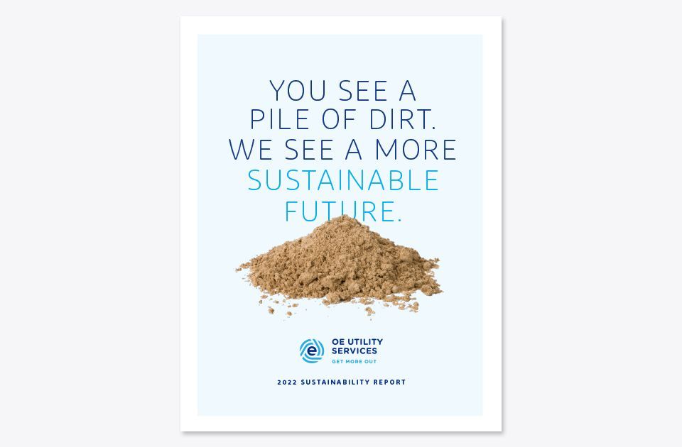
Since 1996, Ontario Excavac (OE) had been a leader in hydro excavation, with an excellent reputation and a recognized brand. Its loyal customer base continued to grow, and the company expanded its service offerings well beyond hydro excavation to include a broad range of utility service support.
“David created a compelling brand identity that seamlessly bridged our former company logo to the new one while mitigating confusion with our existing customer base. The rebrand and transition were remarkably smooth. It is a testament to David’s creative and strategic capabilities with graphic design and branding. We are very happy with the results.”
Barry Wood, CEO
We were approached to help evolve the OE brand to reflect a more current company image. However, maintaining the company’s recognition with existing customers and industry stakeholders was vital so the best strategy was to pursue was a careful evolutionary approach to changing the brand. This included an updated brand identity and a new company name.
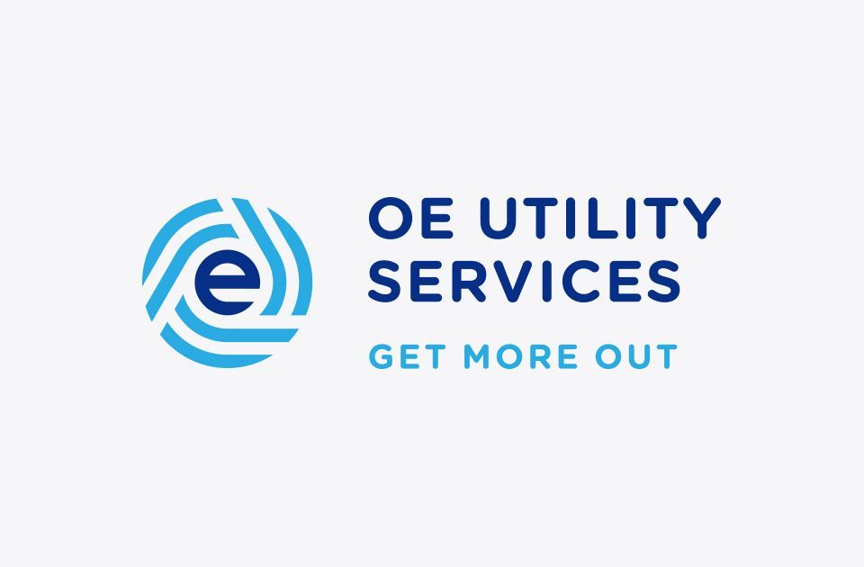
Our research found employees and customers often shortened Ontario Excavac to the acronym OE. Retaining the acronym as part of a new company name would help maintain brand recognition during a relaunch of the business. Pairing the initials OE with “Utility Services” helped reflect the array of fully integrated utility support services beyond hydro excavation the company now offered its customers. We also kept the existing Get More Out tagline because it was still relevant, had brand equity, and provided another element of recognition to the organization.
Our task was to design a symbol that conveyed the new company while keeping a connection with the old branding. Thorne Branding & Design created 3 unique concepts for the client to choose from - all representing a company with an array of integrated services. Each concept used colour and shape to maintain consistency with the old logo.
The new symbol is composed of the letter o that surrounds the letter e using the original navy and bright blue. Bold lines played an essential role in the old logo, so the letter o is made up of a series of curved lines. These shapes are meant to convey a multifaceted company with an array of integrated services. Finally, the circular symbol has movement, suggesting a forward-thinking company offering more than hydro excavation.
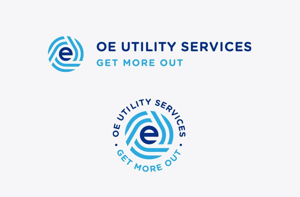
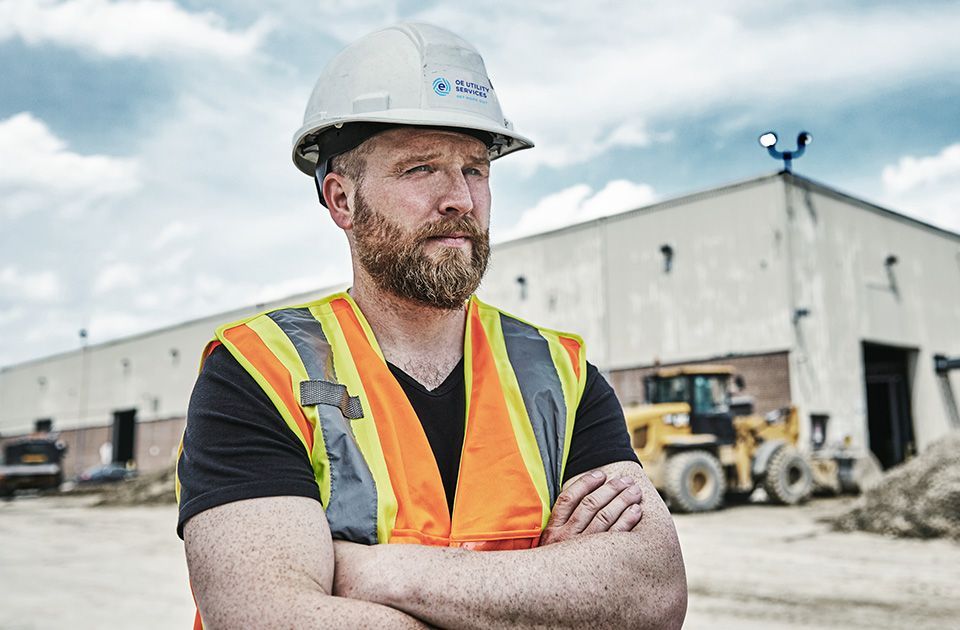
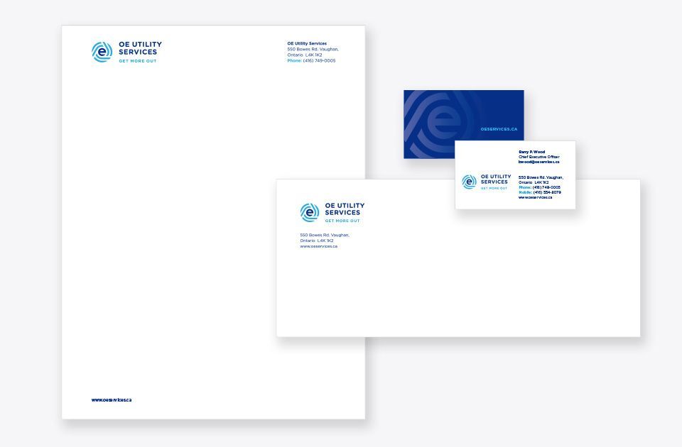
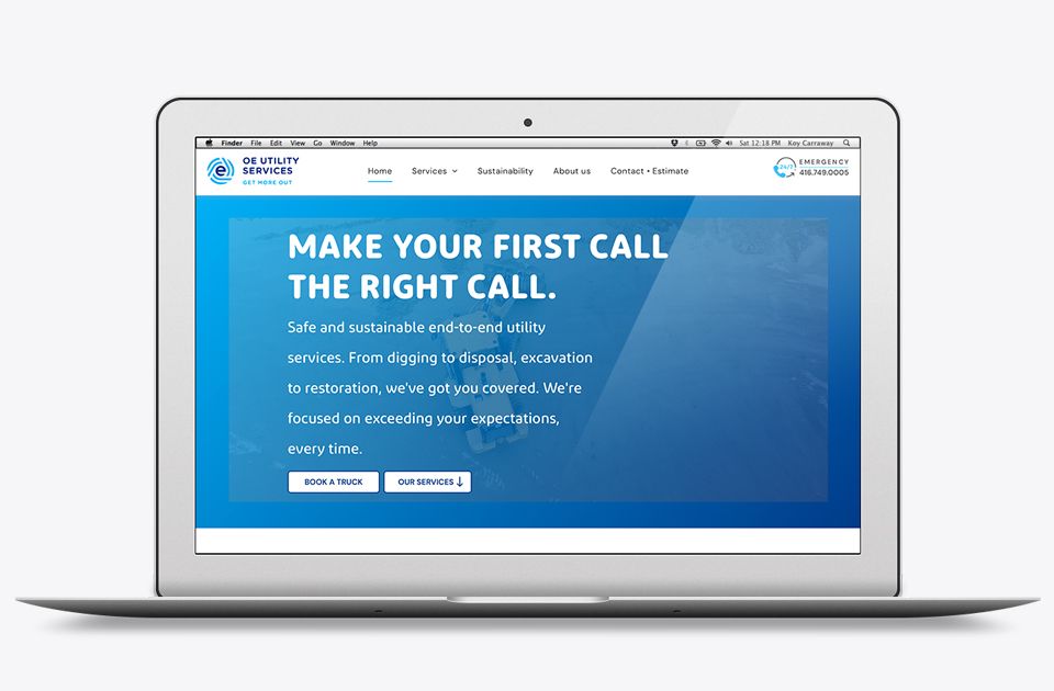
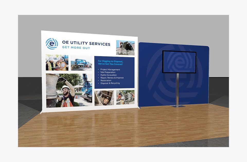
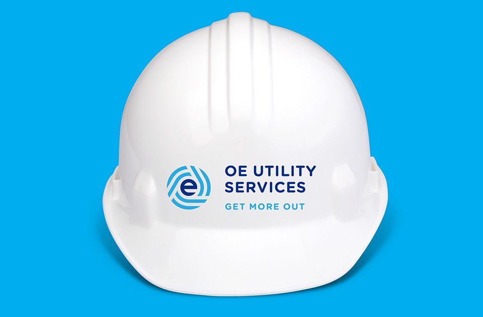
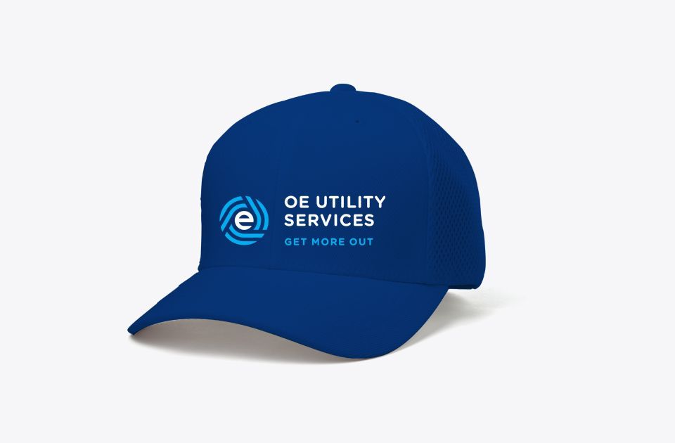
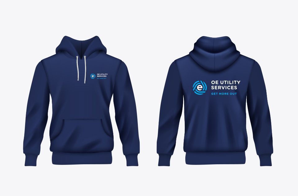
With a launch dated planned, the new brand identity needed to be applied to all customer touch points from vehicle livery and uniforms to website and digital advertising. A comprehensive brand standard manual was created to help with the implementation and ensure consistency with the touch points. Thorne Branding & Design oversaw the implementation using experts in manufacturing signage and vehicle graphics and collaborated with a web agency who built their new site oeservice.ca.
Scope of work
- Brand identity
- Brand identity manual
- Vehicle livery
- Uniforms
- Stationery
- Social media avatar
- PowerPoint and letterhead templates
- Collateral
- Motion graphics
- Social media advertising
- Email marketing
- Signage
- Trade show booth
- Digital advertising